Business Intelligence
First Look: DataCracker's Streamlined Entry-Level Analytics

Spreadsheets are incredibly useful, but not a whole lot of people would argue that they’re the most compelling way of depicting data to an audience.
Likewise, plenty of people who aren’t statisticians by trade have nevertheless had to wrestle with infamously opaque tools like SPSS and Excel pivot tables to try and coax some statistical analysis out of, say a SurveyMonkey poll or a customer survey.
Numbers, a Sydney-based R&D and software company, identified this crowd as an under-served market and moved to respond. DataCracker, a data analysis and visualization app, is the result. How does it measure up?
It’s Hard to Measure Up
The difficulty in evaluating an app like DataCracker is that there’s, as of yet, relatively few direct competitors to use as standards of comparison.
The closest analogs right now are StatWing and DataHero, both cloud-based data analysis apps centered around an easy-to-use interface geared towards end users who don’t do quantitative analysis a full-time job.
Numbers, the company that developed DataCracker, based the app off Q Professional, its more complex statistical package, which is designed to compete with SPSS.
Tim Bock, director of Numbers and management on the DataCracker product, agreed that the similarities are indeed there, but that DataCracker goes about things differently in several key areas.
Office-y Interface
DataCracker takes a markedly different approach from StatWing and DataHero when it comes to user interface, a fact that becomes readily apparent as soon as one logs into the SaaS app through their browser.
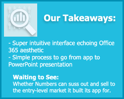
Whereas the two competitor apps feature very slick, modernized interfaces (think of the beveled edges and monochrome color scheme of iTunes), DataCracker looks like Microsoft PowerPoint. Sidebars, interface ribbons and drop down menus all have the same layout and visual weighting that they would in an Office 365 app. According to Bock, the visual similarity was deliberate.
“It’s supposed to feel like one of the basic apps our typical end user is using on a daily basis,” he said.
It’s a really important distinction to make, and one that doesn’t come up too often. Obviously there’s a ton of talk buzzing around right now about consumerizing IT by making the interfaces on business software more like those on consumer apps, but not a whole lot about the idea of intuitive interfaces.
Even an attractive and streamlined interface can be completely opaque to some. It’s because the interface’s meta level–how each individual on it relates to the other–doesn’t build on layout and design schemes the target user has branded into his mind. Navigation bars are across the top of the screen, the help bar pops out on the right, etc. Having those familiar aspects in place makes it much easier for the user to learn the ins and outs through normal use of the app. That DataCracker seems to get this so well–what’s more intuitive to the average office worker than Microsoft Office?–is refreshing.
Data Import and Organization
DataCracker import formats
- CSV
- Excel (.xls/.xlsx)
- IBM SPSS Data Model
- Qualtrics
- QuestionPro
- Snap Surveys
- SPSS .sav
- Super Simple Survey
- Survey Analytics
- SurveyGizmo
- SurveyMonkey
- Toluna QuickSurveys
- Triple-S .xml/.sss
DataCracker has a fairly impressive lineup of formats it can import data from including SurveyMonkey, .sav and .mdd from SPSS and humble everyday .csv and .xls spreadsheet files.
One of the most impressive features we noticed was the way different types of data in a table of sample data was recognized automatically and organized in ways that made for sense. For example, a column listing qualitative values like state postal codes or city names will be depicted much differently from columns quantitative values or binary Yes/No-type array, a critical element for surveys with multiple response formats.
Contrast that against StatWing, where one would invariably end up having to deal with the tedium of telling the system what kind of data is being represented in the columns it can’t recognize off the bat.
On top of that, each individual set is mapped to the type of visualization the system feels best suits it. In the demonstration we checked out a set of one-word responses was visualized in a very cool word cloud graphic. Another cool feature is the ability to merge two columns in a table through a simple drag and drop. While this is only doable with a few types of tables, it’s a drastic simplification of something that might be an ordeal to do in a pivot table, especially for a less-experienced user.
DataCracker’s Slow Start
 Since embarking a “very soft launch” back in July, response to DataCracker has been somewhat slow, Bock said. He attributed this to the challenges that come with having to seek out the target audience for a type of software solution that hasn’t gotten much mainstream play yet.
We’re definitely interested to see where DataCracker and this new world of entry-level statistical analysis solutions go in the near future.
For more detailed information on specific business intelligence solutions make sure to take a look at our Top 10 Business Intelligence Software report.

- Top Expert
Mark Aspillera
Expert in ALM, IaaS and Business Intelligence