Big Data Analytics
Top 10 Most Effective Ways to Visualize Your Business Data

Due to the amount of data businesses need to parse through and act on every day, the data visualization market is growing at unprecedented rates. And businesses of all sizes from all sorts of industries are acquiring data visualization softwarein droves (International Data Corporation). Unfortunately, simply acquiring and implementing a data visualization tool won’t be enough to get them or you ahead of the competition nowadays. But learning the most effective ways to visualize the data such tools handle certainly will.
Why You Need to Visualize Your Data
Before understanding the most effective ways to visualize data, it’s important to grasp why you’ll want to have your data visualized at all, aside from the fact that all your competitors are probably already doing it. To clarify, Data visualization:
- Identifies areas that need consideration or improvement across your organization.
- Illuminates which factors influence customer behavior.
- Allows you to understand what products to place where and when.
- Predicts sales volumes and market trends.
Here are the ten most effective ways you can visualize your data:
1. Gauges
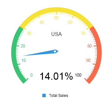
Gauge visualizations are ideal when you’re trying to represent a single key performance indicator or numeric value. They typically look like a speedometer gauge on a car with a ticker that tells you right away whether you’re over or below a certain value. So, if you’re mid-way through quarter one of the current year and want to see how close you are to reaching last year’s total sales amount, this type of visualization will tell you immediately how close to or far off the mark you are. Sometimes color-coding can be visually helpful, too.
2. Line Charts
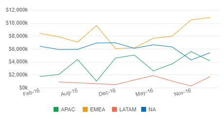
Line charts are most commonly used to represent trends over a span of time, where each line represents a trend. It’s easy to see which lines are going up and down over a span of time when they’re placed horizontally on the chart and color-coded. Businesses use them for sales trends over the course of months and quarters.
3. Column Charts
With this type of visualization, you can compare different category values side-by-side with color-coded vertical bars. You’ll want to use them when you’re comparing fewer than five categories over a span of time. Otherwise, it will get messy. Column charts are usually ideal for values that are clearly visible and easily differentiated. They should always have a y-axis that starts at zero and labels that are easy to read. They’re even easier to see when they’re three-dimensional.
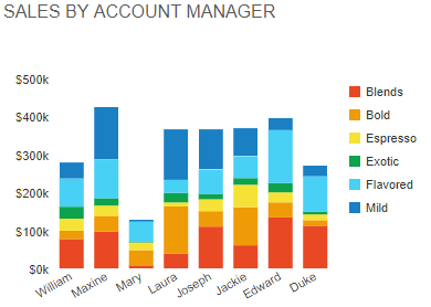
4. Bar Charts
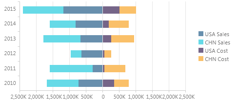
Bar charts look like column charts, except their bars run from left to right along the x-axis. They can be used to represent negative numbers when needed and can have stacked values or categories. They’re typically used for comparative data. For instance, if you want to see which of two mobile devices your six departments most often use, you could have each bar divided into color-coded parts where each section indicates a type of mobile device.
5. Pie Charts
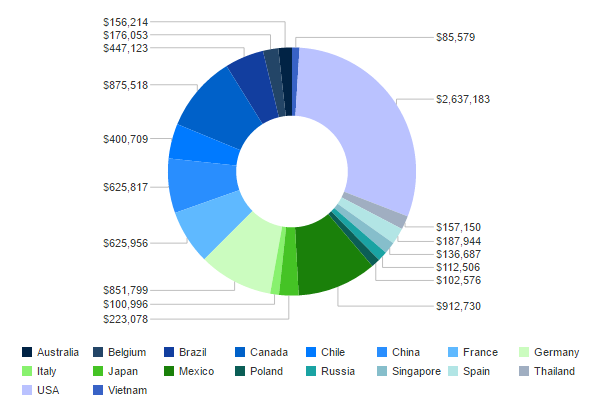
Instead of using axes to compare data and trends, pie charts are spherical and focus on representing percentages. Pie charts are helpful in instantly revealing how much each share (or slice of the pie) represents the whole. A business can use pie charts to understand things like what their greatest revenue generators are or which marketing channel is receiving the most prospects and leads.
6. Polar Charts
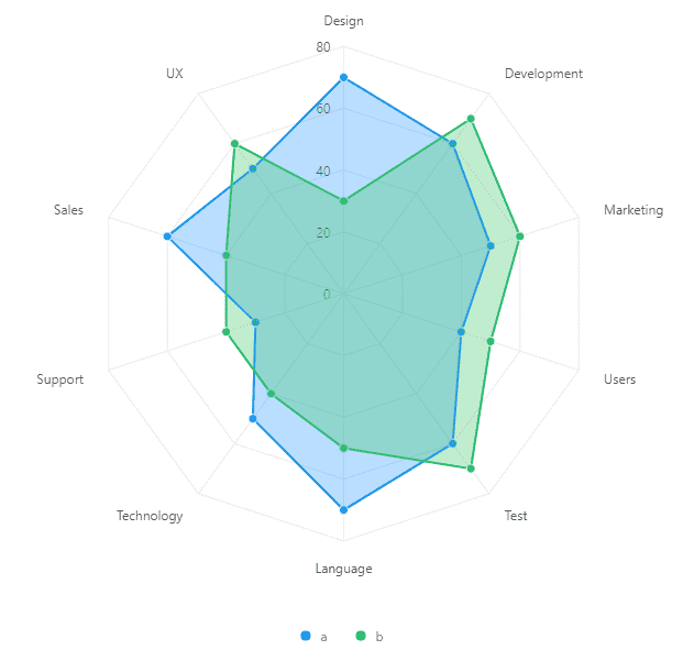
Polar charts look a lot like pie charts, but instead of representing each slice’s share of the whole (percentage) by its size, all the pie slices are equal proportions. The value of each slice is shown by how far it reaches from the center of the circle. The farther the point is from the center, the greater its value. Stacked data with different categories also benefits from these charts.
7. Scatter Plots
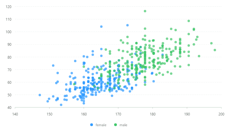
A scatter chart has a y-axis and an x-axis with dots representing variables that are scattered. They’re mostly used for correlation and distribution analyses, and they’re good for showing the relationship between two different variables where one correlates to another (or doesn’t). Each variable is represented by a different colored dot. Scatter charts also show data distribution or clustering trends to assist you in spotting anomalies or outliers. However, you don’t typically use these charts to evaluate specific values.
8. Area Charts
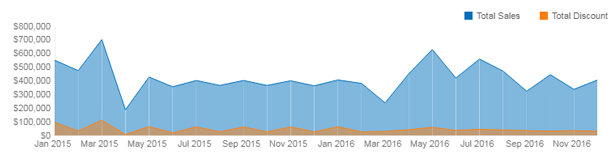
Area charts look like line graphs, filled in with different colors below each line. They offer a great way to see where data overlaps and people often use them to compare revenue with expenditures. Area charts are useful for providing a sense of overall volume for multiple categories and how these categories compare to one another. Such information can give businesses instant insight into how they can better conduct their resources.
9. Bullet Charts
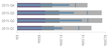
Bullet Charts serve as a worthy replacement to bar graphs or gauges in a reporting environment. Often times, a bullet chart shows the same types of information but will be smaller and more concise in the report. Bullet Graphs showcase or compare singular pieces of information, such as year-to-date changes in revenue. Bullet Charts can provide a quick insight into the data being reported.
10. Heatmaps
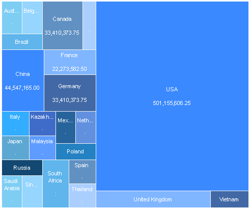
Heatmaps exist to provide a color-coded visualization from a matrix of data – typically colored by order of importance in a dashboard. They are widely used throughout the world, from helping visualize the biological makeup of DNA to helping website owners visualize the most popular sections of their websites. The latter can be incredibly helpful in the business world, as this can allow a business to make data-driven changes to their websites using personalized analytics data.
Quick Tips for Choosing Your Data Visualization
- Choose the visualization that tells the best story of your data.>
- Don’t be afraid to use visualizations that are interactive.
- Make sure the data visualization makes it easier, not more challenging, to comprehend the data.
- Avoid distracting colors, patterns, backgrounds, and labels whenever possible.
All images provided by the Data Visualization Software from Jinfonet.
Photo courtesy of Pexels user Lukas

Taylor Tomita
SEO Specialist, Small to enterprise-level business writer, content creator